
I have chosen to compare my digipak with two others, one very similar and one very different to my own.
Taylor Swift - Speak Now
The first digipak I have chosen to compare mine to is the digipak for Taylor Swift's newest album Speak Now. I have chosen to compare mine to this one because they use many similar techniques to attract the audience but are, although in some ways similar, in many ways completely different and contrasting. This digipak and my own show that the same target audience can be attracted with two contrasting styles and how the same technique can be used in such differing ways. Although on a first glance this digipak looks nothing like my own, on a closer look it is clear they share many of the same conventions and styles to attract a similar target audience.
There are two motifs used throughout Taylor Swifts album that are unconventional and unique, motifs that are not used in other album booklets.


The digipak has the style of a 'novel' or 'comic book' throughout. There is a 'prologue' at the start of the digipak, letting the audience know what to expect throughout the album. In the prologue, Taylor states what the words 'Speak Now' mean to her and how, by making this album, is her speaking up for all the times in the past when she didn't say anything in situations which she should have in her past. This prologue tells the audience that by listening to this album, they will get an insight into life as she goes on to explain that her songs are directed at: 'The beautiful boy whose heart I broke in December. To my first love who I never thought would be my first heartbreak. To my band. To a girl that stole something of mine'. The audience feel like they are being let in on Taylor's secrets if they listen to this album and will know all the things she wanted to say. The 'comic book' motif continues throughout the product as many pages have a image/illustration with a caption, summing up what the song is about.
The second motif used throughout is the 'Secret messages' which are hidden in the lyrics. In every song's lyrics in the album, there are randomised capital letters that when put together, give the audience an insight as to who inspired that song. This motif would make the audience want to buy the album, hoping they will find out Taylor's secrets. This also makes Taylor's album more interesting and fun, so if the audience were to choose between this and a conventional album, they would perhaps go with Taylor's album because of this motif used.


My digipak also uses a motif throughout. The Polaroid photograph motif, unlike Taylor Swift's, is a convention of digipaks and was a motif that was used in many digipak's that I came across when researching. This motif allowed me to show all of the photographs taken, instead of using only one on a page. This motif makes my digipak stand out and breaks up the text, it also allowed me to include the name of the record label and artist in a new way, the font used looks like an autograph, this typography goes well with the collage style as it look as if someone has signed the photograph. All of Taylor Swift's albums have the motif that 'Speak Now' has, relating the products and creating consistency throughout her albums. Also, the audience would recognise this feature and would look for it if a new album was coming out. If our artist were to release a second album, this motif would be carried through, creating a sense of verisimilitude for the audience. The feature I've used of the book quote is a convention of other media texts as they also refer to other products to promote both products at once. This feature will let the audience know that Pixie Lott has a book, making them think that if they enjoy this album they will also enjoy the book.


Here is the lyrics page for 'Back to December' which has the same style as the music video for the song. This is shown by the mise en scene used, such as the artists hair which is straight and has a fringe and also is the colours used.

The delicate style is a feature that both this digipak and my own share. This style is shown here by the aritst in white which contrasts to her dark surroundings. Her necklace also shows this, as it is a locket, suggesting purity which is similar to the way we have used the ring in our photography, symbolising innocence.
My digipak also links to our music video as the artist is wearing the same coat and scarf. This image was used main collage in my digipak, creating consistency throughout.


A convention that both Taylor Swift's and my own digipak have are images that relate to our music video. Throughout my digipak, the photography used uses the same mise en scene as in our music video, creating consistency and letting the audience relate the two products straight away. The same delicate feel is created by the artists wavy hair and soft make-up, making her recognisable. If, in the digipak, she was wearing dramatic eye liner and black lip stick, she would not instantly be recognised by the audience as the same artist as in the music video. The artist is also wearing the same pastel colours in the digipak, making this even clearer to the audience and reinforcing the soft style. Taylor Swift's album also uses this convention by using the same style throughout her digipak that is used in many of her other products.
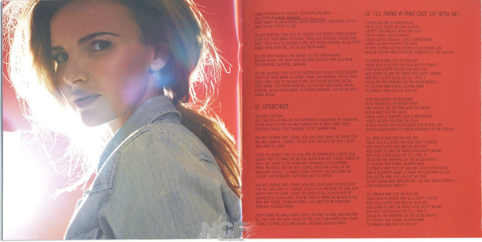
Like my digipak, Nadine Coyles digipak also uses the collage motif, with one main collage and a smaller one, as mine also features.


The scattered photo style is one that both this digipak and my own share however with a big difference. My motif I used to show the photography as I knew our images were strong and showed our style and message to the audience by its colour symbolism and delicate style. Nadine Coyle's digipak however has used this style to create a 'personal' feel for the audience as the image show the artist's personal photographs of her friends and family. This makes the audience feel like they 'know' the artist and Nadine is letting them see her in a new light because they have bought her album. This would make them want to buy more products of hers, thinking they would get to know her more if they did.
This page of the digipak gave me the inspiration for my own. I liked the way the text was broken up by the image and like how it wasn't over complicated but still interesting. This convention gave me that opportunity to show iconography of music in my digipak straight away.

A digipak is very important into letting the audience 'know' the artist and what the album is about. I think, by following the codes and conventions of these digipaks, that I clearly show in my product the personality of the artist my the mise en scene and style used throughout.
No comments:
Post a Comment