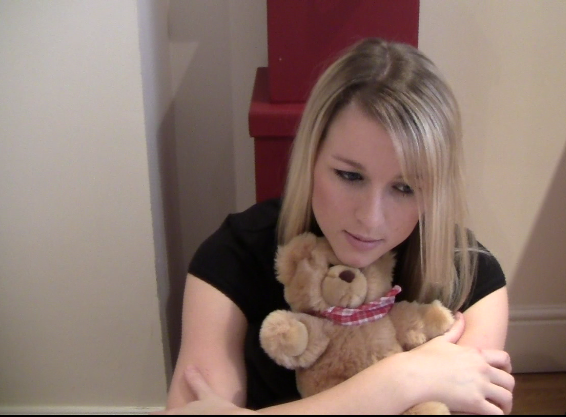
The aim for this project is for my group and I to create a music video that follows the codes and conventions of others with a similar target audience in the current market and use techniques to make the audience relate to it. We hope if the target audience were to see our video, a sense of verisimilitude would be created as our video would use similar features and conventions to others in the market.
I created this style guide which shows the mise en scene and overall style that I wanted to achieve in my ancillary tasks and that my group and I wanted to achieve for our video. The guide also shows a leitmotif of ours, the black and white. Also, the images from this style guide inspired some of our photography and the artists hair, make-up and clothing.
This is a collage I've made to show how throughout both the footage and photography this style was kept:
I also created a guide for the colour scheme to our ancillary products to make sure they all related:
When looking at my ancillary products, this style is reflected in them:
-White text on a pink background
- Soft colours used
- Black text on pink background (Perfume bottle)
- Black text on pink background
- Light colours such as white in the photography used
Here is the font guide that I created in the planning stage of the production process. I created this guide to make sure that all of the text used stayed consistent throughout all of the ancillary tasks.
The print screens shown above show how these fonts have been used throughout my ancillary tasks.
To keep all the products consistent, the music video and my group and my own ancillary products, we used a subtle motif throughout.
The motif is of a 'shine' that comes across in our products. Firstly, in the music video there is a flash of light which gives the message to the audience that the artist is stuck in time, in that moment, because she cannot stop loving her old boyfriend. To reflect this in my digipak I have used the word 'shine' in yellow on my production credits page, keeping the motif consistent throughout. In my perfume advert there is a yellow glow around the perfume bottle, keeping the consistency throughout all of my products, letting the audience know that these products are from the same artist because of the house style used. Also, on Amy's digipak advert she has used Yellow text, letting the audience know that this product also relates to the others.
The colour white is also used in a subtle way throughout all the products, reinforcing the consistent style and motif of a soft and gentle feel. The white text on the perfume advert reflects this style as well as the white bedroom and clothes the artist is wearing in the music video. Also, Sharon's t-shirt is white and pink, making this message consistent and letting the audience know that these products relate, creating verisimilitude for the audience as they have seen this consistency through the products of similar artists, with the same target audience and genre, currently in the market.
The motif of black and white is also used in our main and my ancillary product. The front cover of the digipak is in black and white, as well as the flashbacks in the video. This means that if the audience were to see the video and then wanted to buy the album, they would perhaps recognise it by this motif. This is a technique used my many producers of media texts, meaning this fits in with the codes and conventions of current media texts therefore creating verisimilitude for the audience. Black and white is also used on Amy's album advertisement, making the products consistent.
In both my digipak and CD and on a draft of my perfume advert, the iconic Pixie Lott sign 'XO' is used. This is iconic of our artist, so if for example the CD were to be seen without the case, the audience would know that its Pixie Lott's album without having to listen to it to find out.
During our preproduction stage, a style guide was created so we knew what colours, fonts and themes to use throughout all of our products. When we had made a change to one of our product, we could see if it did or didn't relate to the products of the other members of the group just by looking at the guides.
Here are the guides created:
And here how we've met this style:
The style throughout all of our products is a soft and delicate. This style is shown in the photography, in the types of shots used in our music video, in the mise en scene and in the choices of text and colours I used in my final ancillary products. Because this style is used throughout, my products realate
Mise en scene
To make sure our soft and delicate style was used through both our main and ancillary products we used the same mise en scene in all our products to make sure they related. For example, the outfit the artist is wearing in our photography of light colours to show delicacy, she is also wearing in the music video. By doing this we kept the style throughout all of our products. To reinforce our delicate feel, the artist wore soft make up and had wavy hair throughout and also the same pearl ring which symbolises innocence. This means that if the audience were to watch the music video and then were looking for the album, they would recognise it straight away by the use of mise en scene used. We also research carefully into the types of font that we wanted to use before we started constructing our ancillary tasks. The fonts we all used in our ancillary tasks are very girly and light, reflecting our style. If we used the font 'impact' for example, our style would not be reinforced and a completely different feel and message would be given to the audience, therefore getting a completely different response.
One of the key conventions to making sure products link is to use the same type of camera angles in the music video and photography. We followed this convention, using the motif of close ups in both our music video and ancillary tasks. An example of this is shown bellow:
Before we started our photography, I planned the type of shot we wanted and the mise en scene used. I found this image of Taylor Swift and wanted to capture a similar image of our own artist. I sketched out this image and said what type of shot it would be (close up on a blank wall) and also noted the mise en scene. I planed this photography so we did not waste time when filming and we knew exactly what we needed to capture.
This is the shot that I took. However, although I followed all the plan there was some changes I needed to make in Photoshop to make my image look more alike to the original image found of Taylor.
I made this image brighter by using Adobe Photoshop, by changing the brightness made the final image look more professional and like the image I was aiming for it to look like.
This is the final image. I also used the 'spot healing' tool on Photoshop to remove the artists mole, to created a more flawless look and therefore following the codes and conventions of artists photography.
This is another shot that I liked and wanted to use a similar shot for my ancillary tasks.
When trying this type of shot out on our own artist, we found that a birds eye view shot complimented the artist more than a low angle shot.
When I went to edit this image in Potoshop to match the lighting of the original image I found that there were no changes I needed to make as the brightness was already similar. However, because this shot was not planned well enough, the mise en scene did not fit in with our consistent style, as the artist is wearing black, and therefore I did not use it as a main image in my ancillary tasks. We learnt from this mistake and from then on always planned our photography and filming so no time was wasted in our production process.
This is the story board created at the start of the production process. Throughout the production, several changes have been made.
For example, the first image and caption is of the artist sitting in the cafe writing the letter. However, when we tried to capture these shots, the 'delicate' style the rest of our video had was not shown in these shots, meaning our video did not have a consistent style. Therefore we instead had the artist write the letter on her bed, which not only reinforced the style but also made the audience able to relate to their video more because it is a location they are familiar with.
On our original story board, the narrative was very complex and since we have decided to make it more simple, so the audience can understand it in three minutes. For example, we were going to have the new boyfriend propose, the three of them in the same location and a switching of jackets! Since, we have decided to make this a lot clearer by using black and white flashbacks to show the change of time in the narrative. The basic narrative of our story has stayed the same, however we think these changes benefit the audience more and therefore make our media text more effective.
Of course, we have added alot more shots than this story board shows! One of the mistakes we made was not making our storyboard detailed enough and not showing the camera shots and the effect they would have. To solve this problem and to make sure we didn't waste time when filming, I created this table showing the type of shots we needed to film.
Please also refer to my blog on feedback of rough cut from peers.
Audience feedback is the most important research that needs to be undertaken when creating any product. I created questionnaires to know what my target audience were looking for in new products and based the rest of my production around these responses.
Form audience feedback I have learnt that the target audience like the way they are able to relate to the artist and learn from her experiences, this is part of the uses and gratification theory 'personal identity', making the audience feel like they are not alone. By my group and I using every day locations such as a bedroom, park and street, the audience could relate to the experiences of the artist and found this effective in the music video as a sense of verisimilitude was created for them.
I also learnt from our target audience that the style used was very effective into attracting the audience and the delicate and girly style made my target audience want to see more. For those who were not in our target audience, they liked seeing the dramatic irony in the video and liked the way gaze theory was used. By using these techniques a wider audience was created and from the feedback of these audience members I have learnt that there are many ways to attract any type of person to any type of product if the right techniques are used.
From audience feedback, it it is clear that colour symbolism was also very effective in our products and that this helped the use of character functions, making the narrative clearer.
A response from my perfume advert was that a peer liked the magazine review used, showing that the 'two-step flow' technique I used worked and the audience would buy the product because someone they trust has said it is worth using.
One of the most interesting responses I got from the music video showed 'reception theory'. A girl in the year bellow me said that on her first viewing she didn't like the song used but on her second, when she was watching with people that did like the song, she then begun to like it. Reception theory shows that the audience themselves help to shape the meaning of the text, depending on what mood they're in or who they're with.
One of the more negative comments we received was that our video looked cheap and unprofessional. Although we agreed with this- because the equipment used was not of the highest standard possible, we also agreed our shots used do look professional. If we had all our shots handheld for example, a very tacky and unprofessional response would be given.We think, as do the majority of our audience, that we made the right decisions on the shots used.
Audience feedback also showed that the gaze theory used make the audience feel more pathos towards the artist. For example, because both boyfriends are good looking, the audience felt sorry for the artist as they wound not know what to do and who to pick if they were in her position. If the boyfriends were unattractive, the audience may not feel sorry for the artist because they would not feel sorry for themselves if they were in this situation.
The majority of the audience enjoyed the way that in our music video they saw shots that have previously been used in music videos from similar artists that they enjoyed. For example, the slow rotations used to show romance were very popular with our target audience because they recognised this convention.
A peer said that as soon as she heard the song she knew the artist was the 'goodie'. From this response, it is clear that the perfect song has been use to represent the 'innocence' of our character and that track chosen automatically frames the audiences first response to what the main character's personality will be like.
After comparing our own music video with Taylor Swift's 'white horse' in detail, it is clear that they are similar in many ways, using some of the same techniques throughout. They both also use very different techniques in places but to create the same effect and give the same message to the audience.
Both of these videos use Propps Narrative Theory of 'Character functions', letting the audience know straight away whose 'side' they should be on and to let the character roles be identified before the track has barley started.
Taylor Swift's video does this by using the 'voice of God' technique, to define the videos ideology before they see the action on screen. By using this not only makes the narrative clearer but also defines the character roles straight away. The audience hear the boy in 'White horse' apologising and asking for another chance. The words 'all I want is you' give the clear impression that the boy has cheated on the artist, automatically making him the 'Villain'. The artist could be seen as either the 'hero' or the 'damsel in distress'. The audience know she is not a villain because of her blonde hair, symbolising purity and also the upset expression on her face, showing she has emotion and feelings, not like the villain who did not show these signs. As the audience see the artist's weakness in the video they see her as the 'damsel in distress' however at the end of the video it is clear she has become the 'hero' because she has not let her love for the 'villain' get in the way of whats right. This music video uses the motif of the 'voice of God' throughout, creating a clear narrative for the audience.
Our own music video shows clear character functions by using a different technique. The actions of the characters on screen clearly define the different character roles such as our shot of the artist cooking and the new boyfriend drinking, automatically making him the 'villain'. The shot of the boyfriend putting flowers at the artists door reinforces this idea, as this is a sign of apology, meaning he must have hurt the artist in some way. The juxtaposition of the flowers, suggesting goodness and the 'mean' clips the audience have already seen of the boyfriend shows that this is the case. The lyrics not only let the audience know that the artist is the 'damsel in distress' but also the sense of helplessness for the artist that is shown by the types of shots used such as the artist singing out of the window and writing a letter. If we were to present the artist as a 'hero' instead, she would be fixing the problem encountered instead of feeling sorry for herself.
The colour symbolism used in Taylor Swift's video also makes these character functions clearer, letting the audience know the 'goodie' and the 'baddie'. For example, the 'damsel in distress' is wearing light colours, such as cream and white, and the 'villain' is wearing black and darker colours. The 'villain' has dark hair and the 'damsel in distress' has blonde, making their character roles clear to the audience. Colour symbolism is something we used in our music video, such as the blonde hair and blue eyes of the 'damsel in distress' showing innocent and letting the audience know she is the 'goodie', but something I feel we should have used more to make our narrative clearer.
Gaze theory is used in both videos by the types of shots used. In 'White horse' there is an extreme close up on the artists lips, attracting a male audience to the video as well as the female target audience. Other shots such as the sun shining on the artists face as her boyfriend is watching her are effective as the audience will want a boy to see them like this. Close up of the artist eyes also create this effect as her soft make up is attractive, this later juxtaposes to her mascara running down her face when she finds out the truth about her boyfriend. Slow panning shots also create gaze theory, letting the audience take in the beauty of the artist. The impression is created of 'she does it with ease' as the artist looks incredibly attractive with her hair tied up and no dramatic make up on. The audience want this for themselves, they want to look beautiful without trying like Taylor Swift. This would make them want to watch more of her videos, hoping it will give them clues as to how to achieve this.
Gaze theory is also used in our video by shots such as slow zooms being used and the way the camera is positioned, flattering the artist, such as the shots of the camera slightly tilted downwards. Mise en scene also creates gaze theory for the audience because of the costumes used. An example of this is the shot of the artist looking out of the window wearing a sparkly vest top, the audience are not used to seeing her like this because of the other shots of her in an over sized jumper which symbolises her 'softness' and 'goodness'. Gaze theory is used in both videos to attract the audience to the video and to make them feel more emotion. For example, the boy in Taylor Swift's video is very attractive, making the audience feel heartbroken for Taylor because shes lost him. If the boy was unattractive then the artist would not feel sorry for her perhaps because they would not be sad themselves if he broke up with them. However is the attractive boyfriend broke up with them they would be heartbroken and therefore can relate to how Taylor is feeling in the video. If the target audience were to watch Taylor's video and then ours, they would know what boy they want the artist to be with in the end, the one with the dark hair, similar to the one in Taylor's video.
A style that is used throughout both videos is the soft and delicate style, created by the mise en scene used. Both artists have blonde wavy hair in the videos, creating a soft style. They also have very natural make-up which reinforces this idea, if they were wearing dramatic eye liner and bright red lipstick a 'dark' and 'mysterious' style would come across and create a completely different message for the audience. Both artists wear baggy jumpers of a light colour, reinforcing this style. In Taylor Swifts music video her jumper is falling off her shoulder, this soft feel reflects the soft pace in the music. The locations in both of the music videos reinforce the soft style and also suggests purity and innocence, letting the audience know that the artists are 'good role models' whereas if the locations were down an ally way full of graffiti, this impression would not be created. The locations in both videos are similar, as the 'white rooms' used create the soft and delicate style throughout. The colour white used for the rooms gives the audience an insight into the artist's homes and reinforcing the idea that they are good people. For the majority of the target audience, their parents are the ones that would be buying them the albums or allowing them to watch the music videos. Because of the colour symbolism used, the parents know that these artists are good role models and therefore will continue to buy into their products.
The mise en scene used here makes the narrative clearer in both 'White horse' and our own video. The artists are both wearing oversized jumpers, which could suggest to the audience that they are the jumpers of the boyfriend they have lost, showing that they are still thinking about them. In Taylor Swift's video there is a close up showing the jumper is too long and goes over her hands. This also suggests 'innocence' as the audience gets the impression of a child, creating pathos for the audience as they realise she is too young to be broken. The colour of the jumper, grey, also tells the audience how the artsit is feeling as it symbolises sandness.
Pathetic fallacy is used in Taylor Swift's video, shown by the first shot of the close up of the rain coming down from outside the window and the rain in that continues to pour throughout the video though the window in the corner of the shot. We tried to capture a shot similar to this for our music video, letting the audience know the artist feelings because of the weather outside. However, we were not able to do this because our camera equipment did not capture the rain, it would have needed to be very heavy for the camera to do so. However because of the high quality camera equipment used in the Taylor Swift video, they were able to achieve this. The sound effect of rain is also used throughout, reflecting the artists emotions and state of mind. When the artist is with her boyfriend, the sun is shining in on them, making it clear to the audience she was happy and contrasting to the present. This shows the passage of time, letting the audience know which is the past and which is the present.
The lighting plays a big part in both videos in creating a clear narrative. In Taylor Swift's music video the room is bright when the boyfriend, showing she is happy. When she's in the room alone, the lighting is dim and dull, showing she is unhappy, contrasting to how she felt when she was with her boyfriend. The lighting used also helps to show the passage of time. The lighting and pathetic fallacy shown also shows the right emotions in our video in a contrasted way to that of 'white horse'. When the artist is on the sofa with her new boyfriend, the lighting is dark and dim, suggesting to the audience that she is not happy. However, when the artist is with her old boyfriend the sun is shining. Also, in both music videos the artist only ever smiles when she is with her boyfriend/old boyfriend, making the narrative clearer for the audience. There is a shot in our music video when the artist is walking down a hill and the sun is shining on her, this suggests to the audience that she is moving on alone, as she is walking, and that she will find happiness at the end of her journey and that the sun will continue to shine on her.
There are several motifs in Taylor Swift's music video that are similar to ours. Flashbacks are used throughout, in the same way as ours, and a dip to black is used before each of these flashbacks to show the passage of time, a transition that we also use in our video. Fades are also used to reinforce the delicate style, a motif that is used throughout both videos. Fades are used between shots when there is a dramatic change in location, making the shots smoother and softer instead of sharp shots, which would be created if a transition was not used. Dissolves are also used in Taylor Swift's video at the end of each flashback with her boyfriend. The dissolves used here symbolises the dissolving of their relationship and makes the narrative clearer for the audience.
Iconography of music is used in both music videos as Taylor Swift's uses a record player and our own uses an Ipod. This makes the audience feel closer to the artist, like they have something in common with them. If they see iconography of music in the video they know the artist loves music, like themselves, creating a personal connection for the audience and making them 'want more'. Another transistion that both music videos use is a 'fade to black' at the end of the video. To have a 'fade to black' on the last shot is a common convention in many music videos and the majority of slow songs use this technique so a sharp style is not created. This transistion also add to the smooth and soft style used throughout both videos and is used when there is a change in location, to keep the smooth and soft style consistent throughout.
Both artist are stereotypes for a 'lonely girl', shown by the mise en scene such as blonde hair and blue eyes. If the artist had dark hair, she would appear to be a 'stronger woman'. This is also shown by the pastel colours used throughout, if more vibrant colours were used then the artists would not seem quite so 'helpless' and 'pathetic'. An action to show this is used in both music videos, when the artist is sitting against the wall with her legs to her chest. This suggests that the artist is alone, she is trying to hold on to herself without breaking down. The fact that in both videos the artist is alone in a big room also reinforces this idea.
Midway through 'White horse' another character role appears and we are introduced to the 'helper', who helps the 'hero', in this case 'damsel in distress', to see the truth. The audience can hear the voices of the characters in the instrumentals of the track however when the artists voice comes on again the dialogue is silenced but the audience can tell what is being said by the artists expressions and response. From the expressions given by both the 'characters' it is clear to the audience that the truth is being revealed about the 'villain'.
The next shot is a tracking shot in the night and the dark atmosphere reflects the artists unhappy thoughts and feelings. The tracking shot used suggests the audience are going with her on a journey to confront her boyfriend and also suggests that she is walking out of his life and into the future. The new, darker colours the artist is wearing shows the audience that she is now the 'hero', she is a stronger person and not as vulnerable as she used to be. Tracking shots to take the audience on a journey are also used in our music video, such as the tracking shot walking back from the post box and through the woods. This suggests that the audience is being taken on the artists journey to make the right decisions and to take a look back on her past. The audience will feel closer to the artist because of this, feeling they are now closer to her.
Parallel shots are also used in both music videos, as we see the actions on screen match the audio. Towards the end of 'White horse' the pace of the music increases, met with fast flashes of key moments that the audience have already seen in the music video, showing that the artist is thinking about everything that has happened. The fast paced drums come in to the slow track and the audio becomes louder, parallel to the actions of the artist covering her face in her hands and screaming. The artists crying can be heard over the track which matches the pace of the instruments being used. There is a short instrumental in our video before the a chorus when there is only a few keys played on the piano. These keys match three sharp flashes on screen before the action returns to its original pace when the chorus begins.
It is not only the visual styles of these videos that are similar, attracting their target audience, but also the audio. Although Taylor Swift's genre is Country (although this song is a very similar genre to our own) and our own is Pop, they both use 'fairytale lexis' in their lyrics, attracting teenage girls who want their lives to be like a fairy tale, who want to meet 'Prince Charming' and live 'Happily ever after'. This technique may have been used to reinforce the delicate feel (how many princesses do you see wearing black leather?! ) or to make the audience listen to more of their tracks as they may think that other tracks of the artist would give clues on how to achieve this lifestyle. The target audience make a choice to listen to watch these videos for different reasons. Some of the target audience will see these tracks as a 'diversion', and see the fairytale lyrics used as an escape from their every day routine. However, many will see them as a way for 'persoanl identity', seeing themselves reflected in characters from these media texts. They can relate to these emotions and like the way the fairytale lexis relates to themselves and their experiences. 'I'm not the one you sweep off her feet, leader of the stairwell' the audience will see this as a new way to look at their own experiences, seeing them in a new light. Although some of Taylor Swift's lyrics bring out sad emotions, the audience still want to hear more, knowing they will relate to so much more that Taylor has to say. 'You could be my hero, if only I could let go' the audience find the language used as a new and easier way to express their feelings and will listen to the tracks over and over in hope that it will give them the right words to sum up their feelings. These lyrics are made parallel as they match the actions on screen, for example the lyric 'I was a dreamer' met with Taylor asleep. This technique is also used in our video, when the lyrics say 'you could be my hero' the shot shows a photo of the aritst new boyfriend and as the next line says 'if only I could let go' the shot then shows her old boyfriend, making the narrative clearer to the audience.
A common convention that is used in both of these retrospective videos is the way that in some shots the artist is singing and in some similar shots she is not. These shots allow the audience to take in the artists emotions, shown by her facial expressions and body language. If the artist was singing in every shot then these features may be missed as the audience is focusing on the artists lips instead of the rest of her body language.
There are many similar shots and camera angles used in both videos that create the same effect. Firstly, they both have establishing shots, letting the audience be aware of the location straight away and allowing them to see where the actions will take place instead of starting the action immediately. These establishing shots are long shots, letting the audience also see where the artists are in the present time as these are both retrospective videos.
Another reoccurring shot that both music videos use is the shot of the hidden camera. For example, in Taylor Swift's music video during the flashbacks of her and her lover, the camera is placed behind furniture. These angles used makes the audience think they are looking in on a private moment almost like they are spying on the lovers. This creates the impression that nobody knew about their relationship, if they did more 'open' shots would be used whereas these angles create a 'sneaky' impression reflecting what the audience later find out about the 'villain'. In another shot, the artist and her friend are talking in a cafe. The way the camera is position makes the audience feel like they are sitting on a separate table in the cafe, watching, like they are there. To reinforce this idea, a waiter walks in front of the camera, blocking the audiences vision. The creates verisimilitude for the audience, as they feel like they are closer to the conversation would be and that this would be how if would look and feel like if they were really in a cafe and listening and looking in on a conversation.
Our own video uses this technique, such as the shots through the window. The audience are watching the artist but they are not in the same room as her, it is as if she is alone and she doesn't know anyone else is there, contrasting to the shots where she is singing into the camera making the audience feel she is aware of their presence. This also suggests secrecy, like Taylor Swifts video, because nobody but the audience know of our artists true feelings for her old boyfriend.
More tracking shots are used in both videos effectively. making the audience feel as if the artist is taking them on a journey back to their past and on a journey to find whats the right thing to do concerning their boyfriends. These shots create a 'personal' feel for the audience. Towards the end of both videos, there are shots that show the artists walking away. The audience now know that their decision has been made, they are walking into the future without their boyfriends and are stronger than the were at the start of the video because of their decisions.
There are shots used in both music videos of the artist and her old boyfriend being affectionate. This makes the audience feel sad for the artist as they know she has lost them. If these intimate and happy shots were not used the the audience would not feel this emotion for the artist and therefore the video would not have the same effect. Gaze theory is used again here as both boyfriends are attractive and the target audience feel sad for the artist because they feel they would be devastated in they lost this boy. The male gender watching will also feel sad for the artist, thinking that if they were her boyfriend they would not have treated her this way.
Iconography of youth is also used in both videos, to allow the audience to relate to the artist and feel they have something in common with them. Taylor Swift inspired this idea for our own video.
Overall, Taylor Swifts 'white horse' uses many of the same techniques as our music video and many different techniques that nevertheless create a similar effect. This was a video that, during our pre and post production stages, we kept watching as we thought the video would appeal to our own target audience and wanted to use some of the same techniques to make our video as effective as Taylor Swift's. We wanted to create the same delicate style, knowing from audience feedback that this is the style that the audience wanted. I think from using some of the techniques and motifs that this video uses, we were able to create this style and meet our goal, therefore following the codes and conventions of a music video currently in the market. Although Taylor Swift is a country artist, this song is very similar to our own because of its slow and emotional audio and because of the piano used throughout. From researching, it is clear that Taylor Swift target audience is the target audience who would be a fan of our music video if it were to be in the market, this is the reason why we have followed the codes and conventions of her videos, as well as others of the same genre, as we know that if the audience are attracted to Taylor's style, then they would also be attracted to the styles and motifs of our music video.