About Me

My photo
The aim for this project is for my group and I to create a music video that follows the codes and conventions of others with a similar target audience in the current market and use techniques to make the audience relate to it. We hope if the target audience were to see our video, a sense of verisimilitude would be created as our video would use similar features and conventions to others in the market.

Wednesday 30 March 2011

Evaluation: Media technologies to construct, research, plan and evaluate

Research
A media technology that played a big part in my research was the Internet. I not only used websites such as YouTube to research music videos to make sure my group and I were following the conventions needed but the Internet also played a big part into constructing and planning my ancillary tasks. By using search engines such as Google and online stores such as Boots.com, I was able to research into celebrity perfume adverts currently in the market to make sure my own looked professional. I also researched a variety website galleries from current artists' to see what types of photography I should be taking for my Digipak, these websites also allowed me to research Digipak front covers. Here are some of the websites that helped me in my research stage:
http://www.pixielott.com/
http://www.taylorswift.com/
Construction
I have used three different programs to construct my ancillary tasks- Adobe Illustrator to create my perfume advert and CD Case, Adobe InDesign to create my digipak and Adobe Photoshop to edit all my images.
I firstly used these software's to create layout's for my products, I then edited all my images of Adobe Photoshop, by changing the levels of brightness and using the 'spot healing' brush to create a flawless look on the photo's, helping to use the technique of Gaze theory on my products. I then 'placed' the images on the various programs and built up the construction of my ancillary products from there. Luckily, because these programs are all Adobe it meant that they all had the same fonts and colours meaning that I could create the same house style, making my products consistent.
My group and I used the software Adobe Premiere Pro to import our footage and edit our video. We used the video transitions and effects on our footage to create a professional looking final product.
I also used the software Picasa in my construction stage to create the leitmotif in my digipak, which I then placed onto Indesign. We used different types of filming equipment to construct the types of shots we needed for our music video.
The track was used to create steady shots, such as the artist walking down the road and the shots taken in the woods. The Dolly was used to create steady movement in smaller spaces were the track could not fit, as were used for shots such as the establishing shot at the beginning of the music video in the artists bedroom. The tripod was used to make sure close up shots were steady, if we used these shots without the tripod a different effect would be created. Using the equipment was a new experience and as we progressed further into our production process we learnt more about the variety of shots we could create and the effect they would have on the audience.


Adobe Photoshop


 Adobe InDesign


Adobe Illustrator


Adobe Premiere Pro


Video's evaluating techniques used


Picasa


Planning
Media technologies also played a big part into the planning stage of both my ancillary tasks and to the music video. To plan our ideas for our music video, we pitched our ideas to our teachers and uploaded the video onto Blogger and also created mood boards and story boards by putting together a selection of images from current artist's found online on various websites. To plan the shots we wanted to use in our music video we watched a selection of music videos with the same target audience as our own to see how they were effective. I also used the software Picasa in my planning stages to create mood boards and style guides:

Evaluation
To show the evaluation of both the music video and my ancillary products I have used interactivity such as uploading podcasts and videos to show myself evaluating these products and uploaded them onto Blogger.  To evaluate the progress of my group and I, I have compared current music video's from YouTube to our own, showing how the follow the codes and conventions. I have also uploaded video's of the same genre as ours and explained how we have met this genre. The video's I have uploaded show why I have used certain techniques to attract the audience to my ancillary product's and I have also uploaded podcasts showing my progress throughout. I have an evaluation blog on Social Networking Sites and why they are imporant and how I used them as a convention in my digipak. To do this, I used social networking sites such as Twitter, Facebook and Myspace in my production process to help me identity the codes and convetions of media products which incorporate new technologies.


Development: CD production process


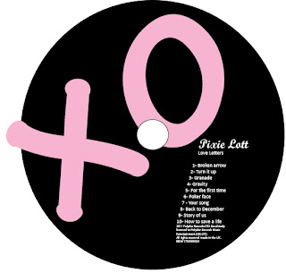
I used a large 'XO' as the main feature of my CD as it is a motif used throughout our products. I then added a track list which is a common convention of Cd's and put the production credits underneath. However, I was not happy with the way the CD looked, I thought the track list made the 'XO' feature stand out less and I decided that I wanted the 'XO' to be larger, making the CD unique. Therefore I decided not to have the track list on the CD.


At this stage in the development process my CD was starting to look professional. However, there were conventions I needed to add if my CD were to be sold in an album. I added the Polydor record label as this is a convention that every CD has. To make my CD look more professional, I added production credits and a copyright logo, another common convention.


Adobe Photoshop was used to take away the background from the copyright logo (found on Google), making it transparent. The logo was originally black, meaning that it could not been seen against the background. To solve this problem I made this white by using the colour range tool on Photoshop and changing the colour by using the select tool.
After researching into Cd's of current artist's and trying all of the different styles out, I decided that the feature of having the production credits around the CD looked best with our house style and other elements of the CD. This is a feature on many CD'S, matching the conventions needed. To get this effect, I used the type on a path tool in adobe Photoshop.


I decided to change the colour of my CD from pink and black to white and pink because this follows the house style of my products and reflects the 'delicate' style used throughout.
When I looked closer at CD currently in the market, I noticed that my production credits were too near the end of the CD and to follow the conventions of Cd's I needed to have a slight space before the production credits.


Development: changes made in perfume advert and final product


Here is my last draft of my perfume advert and my final product. I have made some changes between the two to make my perfume advert more appealing to the audience. Firstly, I didn't think the perfume bottle I originally used was right for my product. It was not 'girly' or 'delicate' enough and therefore was not consistent with the other products, therefore not attracting the audience to the extent it could. The new perfume bottle I think is more appealing- it's colour matches the house style and the text used makes it look much more professional than the one previously used. Also, the glow around the bottle stands out a lot more because of the contrasting colours.
To reinforce the motif of the colour white used in the music video and on other ancillary task's created by members of my group, I changed the colour of 'With Love...' from pink to white. This not only makes the text stand out more but also fits with the style more as it matches the colour of the artist's scarf and the pearl in her ring. The pearl symbolises purity and innocence, which mirrors the 'soft' and 'delicate' style used throughout all of the products. This also makes the audience idolise the artist more as it shows she is a good and kind person. Also, if a parent were to be buying the perfume for their daughter, they would be happier and more likely to buy it if this message were brought across rather than if a rebellious style was used. This would perhaps lead the parent to buying more products by the artist, such as her album or concert tickets.
Following the codes and conventions of perfume adverts, I moved the information of where to buy the product to the centre of the page. Although this was only a small change, I think it makes the perfume advert look much more professional.
After asking my teacher for feedback on the product, we agreed that I should make the banner of my product a lighter pink so the heart next to the artist's name could be seen. The lighter pink also fits in more with my house style as a light pink is used throughout the digipak. It also reflects the delicate and soft style used throughout, if I kept the hot pink then a 'sexy' feel my be put across to the audience, a style which I did not want to create.
I think the perfume advert is very similar to those currently in the market, making it modern and therefore matching the personality of the audience. If the perfume advert look old fashioned then the audience would perhaps not buy this product because they would think the perfume would make them smell old fashioned. However, if the perfume advert looks stylish and modern they would be more likely to buy it because they would think that the smell of the perfume would match their personality. The gaze theory is used as the audience think that if they wear this product, they would be modern and stylish like the artist.

Development: Rough cut feedback from peers

To make sure we made our video as best as it could be we showed our rough cut to our peers and asked them how we could make it more appealing for the audience.
One thing that we got a lot of comments on was the lip syncing. Because we edited the video on a small screen, some of the lip syncing errors we could not see until we put it on a bigger screen. To solve this problem, we made the screen much bigger and got more than one person to watch the clip to make sure the lip syncing was perfect.
Many of our peers thought the shots that we used looked professional and that the leitmotif of the black and white narrative used was effective to tell the story. Many peers recognised the flashbacks used as an intertextual reference to other music videos using the same feature, such as Taylor Swift's 'White Horse' which has the same target audience as our own. This means that if someone were to watch Taylor Swift's music video it would remind them of ours which would make them then listen/watch our own music video.

Sunday 27 March 2011

Development: Parallel Sound

During the research stage in my production process I spent a lot of time researching common conventions of music videos to make sure that our video followed as many codes and conventions as it could, to make sure of video looked professional.
A convention that appeared in many music videos was that of parallel sound, matching the shots to the musicality of the video so that the actions of the artist match the diegetic sound that the artist can hear and the non-diegetic sounds that the other personalities in the video can not.
An example of this is the quick sharp cuts that are used towards the end of the video reflecting the rhythm of the piano solo. The shots appear and disappear on and off screen as a new key is played and stopped on the piano, letting the actions match the audio.
A dip to black was also used towards the end of the video when the music went up and faded away when the music returned to its usual tempo. This is example of how the transitions used in the music video helped us to reflect the music, following a common convention of music videos.

Development: Connotation of Motif's throughout products

To keep all the products consistent, the music video and my group and my own ancillary products, we used  a subtle motif throughout.


The motif is of a 'shine' that comes across in our products. Firstly, in the music video there is a flash of light which gives the message to the audience that the artist is stuck in time, in that moment, because she cannot stop loving her old boyfriend. To reflect this in my digipak I have used the word 'shine' in yellow on my production credits page, keeping the motif consistent throughout. In my perfume advert there is a yellow glow around the perfume bottle, keeping the consistency throughout all of my products, letting the audience know that these products are from the same artist because of the house style used. Also, on Amy's digipak advert she has used Yellow text, letting the audience know that this product also relates to the others.


The colour white is also used in a subtle way throughout all the products, reinforcing the consistent style and motif of a soft and gentle feel. The white text on the perfume advert reflects this style as well as the white bedroom and clothes the artist is wearing in the music video. Also, Sharon's t-shirt is white and pink, making this message consistent and letting the audience know that these products relate, creating verisimilitude for the audience as they have seen this consistency through the products of similar artists, with the same target audience and genre, currently in the market.

Research: Lyrics

When researching, we asked our target audience what they would want to see in a new artist and what meaning/message they would want her songs to have. Feedback from the target audience told us that they wanted the artist's lyrics to match emotions they may be feeling or have felt, something they could relate to and something that matches with their own lives and experiences. 'Broken Arrow' was our chosen song because it brought this to the audience- many of our target audience have said that they can relate to the lyrics of the song and the song therefore becomes more personal to them, meaning they will listen and love it more.
A artist who's lyrics also relate to her target audience is Taylor Swift. A comment was left on Taylor's song 'mean' on YouTube saying 'Taylor, give me my dairy back?'. This shows that the audience can relate to Taylor's songs and by doing this more of that target audience will listen to her songs or buy her album because they think if others their age can relate to her music than so will they. The lyrics of a song play an important part into the size of the audience and by having lyrics that the audience can relate to or that can inspire them is in my opinion the best way to gain a audience that will listen to not only one particular song but every song that is released by that artist. If the audience can relate to one song they would be likely to listen to more, thinking that can relate to these too because themselves and the artist are similar.

Taylor Swift- 'Invisible' 

This song by Taylor Swift is one many school girls, Taylor's target audience, can relate to. Because the target audience is still in school, the song will also become more popular because of word-of-mouth.

Thursday 24 March 2011

Research: Back of album

As part of one of my ancillary tasks, I created a album back cover to make my Digipak complete. To make sure I followed the correct codes and conventions, I researched into album back covers of artist's with the same genre and target audience as my own in the current market. The main conventions that all of these album's featured were:
 - Main image
-Bar code
-Track names
- Production credits
- Logo of record label
- Strips on each side of the back cover so when the album is stacked, the audience can recognise it
Although this back cover is very effective in the way the image relates to the music video for 'Love Story' because the artist is wearing a Victorian dress which she is wearing in the video, creating an intertextual reference, I do not like the white text on top of a cream background as the colours are not contrasted enough meaning that the text does not stand out to the audience on a first glance.


This back cover is also very effective- the image makes the back cover interesting and gives it a 'wow' effect. The artist's eye make up will attract the target audience to buy the product as the gaze theory is used here. The image also reflects the name of the album 'beautiful eyes' which I think is a effective convention. However, I think again that the text and the background do not contrast enough but this is a motif throughout Taylor Swifts album's to use light colours. This means that if the target audience were attracted to her last album because the colours are similar they think they will also be attracted to this album. If the colours suddenly changed to dark colours then the audience will feel that the type of music has also changed to perhaps a rock genre. The colours used here symbolise the happiness and delicate feel that Taylor Swift's lyrics bring across to the audience.

I think the colours used on this digipak are very well contrasted so that all the aspects of the cover stand out to the audience. The white text of the tracks and the record label stand out against the contrasted black background and the artist who is wearing black stands out against the white smoke effect that has been used. The glow of light used in the background gives the message to the audience that if they listen to this album, it will teach them how to shine.


 I thought this back cover was effective by the way the songs names are scattered over the page with the white lines, creating a very modern and unique effect. However, this is not the style I was aiming for my own product as I wanted to use an image of the artist in the background, letting me make the most of the photograph's that have not previously been used as a main image.

Although the photography used here is strong, I think that the track list does not contrast enough with the background meaning that the text does not stand out enough to the audience. I was sure to avoid this when creating my product as the text standing out is a common convention of a back cover, as I have found in my research.

This is a back cover that is similar to my own as it uses the same delicate and soft style and has the same pink light overlay. Another similarity between this one and my own is the style of the handwritten font used on the strips. I think that this is an album back cover that would attract my target audience and therefore it has inspired my own ideas, hoping for my back cover to also do this.


Wednesday 23 March 2011

Development: Changes made in digipak


This was a page in my digipak which featured the artist's websites and a competition for the audience. I also used a horizontal poster feature which is a feature I had seen used in a digipak and thought was effective. However, there were two problems I encountered and had to take into consideration:
1. Although I had seen the poster feature used it was only in one digipak and was not a common convention. The artist that used this feature was Rihanna and she was able to use this feature in her Digipak because her fan base is already large so she doesn't necessarily have to follow the codes and conventions to attract the audience as everybody already knows of her music.
2. Production credits is a feature that almost every digipak has and therefore I decided to change this page to a production credits double page so I met the codes and conventions of a digipak, creating a sense of verisimilitude for the audience as they are used to seeing this feature on other digipak's.


When I gave this draft to my teacher, he said that he liked the layout and style of the page but that I should take away the gaps between the images. When I showed this draft to one of my peers, they pointed out that I had already used the image of our artist sitting against the mirror and the artist on the rug in the previous collage and to show the range of photography that we have I should use new images that have not be shown before. I therefore changed two of the four photos to images the were not previously used in my collage.


The image on the top right is very similar to the image used on my perfume advert meaning that if the audience were to see the perfume advert and had previously seen the Digipak they would be able to relate the two products straight away. My group and I have used the same types of images and house style throughout to insure they relate as other products of similar artists do.
To make sure my production credits had the same occupation names as other digipaks I followed the same style as a current Digipak. When I gave this too my teacher for feedback the advised me to change the production credits slightly as some said 'by...' and others had a colon. I shall put a colon on all of the occupation and names to ensure that this convention is followed.
An intertextual reference is used and the top of the page as I have put a quote about the production team from an autobiography by the artist. This means that if the target audience were to see the digipak, it would make them aware that Pixie Lott has an autobiography and make them want to buy it thinking if they like this album then they must like the book.
The font used for the quote is also 'Handwriting- Dakota', a font used throughout my ancillary products, making them consistent.

Development: Digipak Motif


A consistent feature throughout my digipak is the Polaroid photograph feature as well as the autograph typography that is used with this feature. To make this motif more recognisable and effective, I shall change the font of the main college to a smaller size to match the font of 'Polydor records'. The perfume advert also has the font 'Handwriting- Dakota' which makes each product more recognisable for the audience. This connotes that if the audience were to see this font with the same house style on another product, they would know straight away that it relates to my artist. By having the same font attracts most of the audience to all of the products whereas if the house style and font varied from product to product, some of the audience would not be attracted to certain products.
Amy, Sharron and I have all used the font 'Calibri' in our ancillary tasks, creating consistency throughout all of the products and meaning that the audience are able to see that the products relate straight away.

Tuesday 22 March 2011

Research: CD

As part of one of my anicllary tasks, to go with my Digipak and CD case, I am also creating a CD. To make sure my CD looks profesional, have have reseached into CD's currrently in the maket to make sure mine follows all of the codes and conventions.
I followed the feature of the text going over the outter circle in my own CD. When comparing CD's that used this feature to CD's that left the circle white I thought CD's such as this one and my own looked more effective and profesional.

Altough this CD is perfect into attracting its target audience, young teenager's, this CD's layout and features would not attract our target audience as they would be looking for a more sophisticated, classy and modern look, because they would think this matches their personality.


As shown in my development, this CD is similar to how my first draft. I added the track names to the CD and also the production credits and logo's for record companies. However, although I still have all of these conventions on my CD I decided not to use the track list as I wanted my text 'xo' to cover the whole of the CD as I had seen this convention on another CD and thought it was effective.
However, this is the CD that I got the my inspiration from, I have used the features of the layout in my CD such as the large letter and the contrasting background. However, my CD uses the house style to match the rest of my groups' and my own ancillary tasks, making all the products consistent throughout. This will create a sence of virismiltude for the audience as products following one colour and text sheme is a convention of anlillary products. 
This is a CD that follows many codes and conventions e.g. record label logo, production credits and track list. A feature that I like on the CD is the image, which reflets the freedom and youth that many of Taylor Swift's songs are about.

 This is the CD that inspired me to have the production credits around the CD instead of in a paragraph. Also, because this CD used the record label logo on the CD I also added this feature, following the codes and conventions of a CD. This is Demi Lavato's album CD and I decided to follow this CD because this artist and our own had a similar target audience meaning that if the audiene are attracted to this CD layout, they will also be attracted to mine. This CD also uses the large letter feature aswell as Pixie Lott's official CD, meaning that the audience is attracted to this feature.

Monday 21 March 2011

Development: Shots to tell the storyline of our music video & consistency between music video and ancillary tasks

The music video is under 4 minutes and therefore if the storyline is too complicated then the audience will be confused, it is not like a film where the characters have time to be explored. Our story was too complicated and the old boyfriend and new boyfriend were hard to tell apart so some drastic changes needed to be made to get the correct message across to the audience quickly and effectively.
At the start of our production process, we make both the boyfriends 'nice' as the lyrics didn't say of one showing nasty behavior. However, this meant that the audience were not clear of the roles of the two different boyfriends so we make her new boyfriend 'nastier' and her old boyfriend laughing and having fun with her so the audience could tell who the artist wants to be with and the storyline is made clearer.
[shot of G drinking]
This shot shows that the artist's new boyfriend is taking advantage of her and by using this stereotypical shot of the woman cooking and man drinking this message is given to the audience straight away.


Although the boyfriend is doing something nice in this shot, the message is clear that he has previously done something wrong. The given of the flowers on her doorstep suggests he is sorry for something and wants to make it up to her and the fact that the artist is not there suggests she does not want to talked to him, the shut door also symbolizes that the artist has shut him out of her life because he has not treated her right. The first time we took this shot we took it at night, this however didn't work and wasn't consistent with the next shot as the next shots shows the artist watching him out of the window but it is light outside. We therefore retook this shot during the day to make the story line clear.
[old boyfriend]
All the black and white shots of the old boyfriend are happy and show the artist smiling. This contrasts to the rest of the footage which shows the artist looking upset and in thought. The old boyfriend shots are the only ones which show happiness in the artist, letting the audience know straight away that the artist is reminiscing on happy times, wishing she could go back to the past.


This shot tells the audience that the artist is thinking back on times she shared with her old boyfriend and from this shot the audience gets the impression that the old boyfriend is the one that gave her the teddy bear.


This shot shows I think shows clearly who the artist's true feelings are for. This is an over the shoulder shot, what puts the audience in the artist's personal space, as if they are seeing something that is personal to the artist. This shot allows shows the artist deleting a photo of the new boyfriend, clearly showing she does not want to keep thinking about him. The next photo on her phone pops up when she has deleted the first and shows a photo of her old boyfriend. She does not delete this photo, showing the audience that she still cares for her old boyfriend.


It is a convention in music videos that there are some shots with no singing so we decided to put shots with no singing in our music video, creating a sense of verisimilitude for the audience. In these type of shots previously we have shown the artist's face, letting the audience see her emotion. In this shot however, we wanted to try something different, getting in all the techniques that we can. We took a shot of the artist leaning against a mirror, writing 'broken' on the mirror in lipstick. This tells the audience exactly how the artist is feeling. We decided to use a neutral colour lipstick instead of a bright red because the neutral colour fits in with the delicate feel and style of our music video and ancillary tasks whereas the red would have suggested that the artist wanted to be 'sexy', a style that we do not want the audience to think when watching our music video. The photograph used on my CD case is a photograph against the mirror and the artist is wearing the same clothing. Doing this kept the music video and my ancillary tasks consistent, this means that if the audience watched the video and wanted to buy the album, they would recognize it straight away. This is a convention of a music video, creating a sense of verisimilitude for the audience.

Research: Record Label and genre

Polydor Record label
If our artist's music were to have a record label I think that Polydor would be the ideal record label to produce/distibute our music video. Polydor own singers who have the same music genre as our own, such as:
Selena Gomez


Ellie Goulding


Miley Cyrus


Nelly Furtado


Cheryl Cole


The saturdays


Nicole Scherzinger


If the audience knew the artist was owned by Polydor, they would be more likely to download the album or watch the music video as they would most likely be fans of Polydor's other artist if they enjoy that music genre.

Genre
Our music genre is pop but more specifically pop that most popular with the female audience. This is also the genre of the above artist's.

How does our music video meet the codes and conventions of this genre?
- The motif of the soft and delicate style used throughout
- No swearing or nudity is used in the video
- Most pop songs have slow verses and a faster paced chorus
- Most pop video have a clear narrative

Evaluation: Intertextual Reference

Both the official video 'Broken arrow' by Pixie Lott and our own video use the leitmotif of flashback's. This effect is also used in many other music video's and by using this in our music video creates an intertextual reference to others that use it, making the audience think of the other music video's it has been used in.
By having an intertextual reference in our video means that verisimilitude will be created for the audience and the audience will know our product follows the codes and conventions of a music video. Also, if the audience were to watch another video using the flashback effect then they would then think of our music video and go and watch it, thinking it would be as good as the video they were currently watching.

Development: Last filming session


Evaluation of last filming session 

Last shot- Handheld

Evaluation: Word of mouth

Our target audience is between the ages of 14 and 25 which is the age most likely for word of mouth to be most effective. The majority of this audience is still in education, whether it's school, college or university. The connotation of this is that every day this age group communicate with others of the same age and therefore in the same target audience. Because of this, word of mouth plays a big part in getting more fans for the artist and therefore more profit and credibility. People in this age group are at a very sociable age and at that age to be into the latest music, meaning they will tell their friends in they hear a good song, therefore the audience is forever expanding. However, word of mouth is not always a good thing. Someone could tell a whole group of friends that a song is not worth listening to and therefore a whole group of the possible target audience would not listen to the song, thinking if their friends don't like it then neither will they, as their taste's are similar. One person's opinion can change the size of the audience, for better or worse.

Development: Motif's

There are several motif's used throughout the video that we added when editing. We have used the motif of a delicate style throughout all our ancillary tasks however when researched we noticed that it was a common conventions for music videos to have motifs created in the post production process and editing process. Therefore, we added two leitmotifs into our music video to follow the codes and conventions and therefore creating verisimilitude for the audience.

Fades
The fades used in our video serve as a motif, letting the audience recognise our style. This motif creates a soft and delicate feel, a consistent style used also in our ancillary tasks. The motif allows the products to relate and if the audience were just to see a few seconds of the music video, they would recognise it straight away because of the motif used.

Cut jump shot
This was a motif our group created ourselves using Adobe Premiere Pro. This effect allows the plain shots of the music video to be made more interesting and also creates movement. The effect this transition creates is similar to a heart beat which could reflect on the fact that the artist is pouring her heart out to her new boyfriend in the letter she is writing and in the lyrics she is singing.