
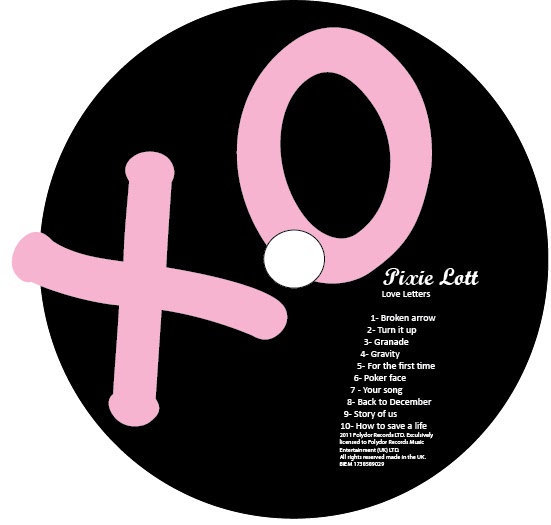
I used a large 'XO' as the main feature of my CD as it is a motif used throughout our products. I then added a track list which is a common convention of Cd's and put the production credits underneath. However, I was not happy with the way the CD looked, I thought the track list made the 'XO' feature stand out less and I decided that I wanted the 'XO' to be larger, making the CD unique. Therefore I decided not to have the track list on the CD.

At this stage in the development process my CD was starting to look professional. However, there were conventions I needed to add if my CD were to be sold in an album. I added the Polydor record label as this is a convention that every CD has. To make my CD look more professional, I added production credits and a copyright logo, another common convention.

Adobe Photoshop was used to take away the background from the copyright logo (found on Google), making it transparent. The logo was originally black, meaning that it could not been seen against the background. To solve this problem I made this white by using the colour range tool on Photoshop and changing the colour by using the select tool.
After researching into Cd's of current artist's and trying all of the different styles out, I decided that the feature of having the production credits around the CD looked best with our house style and other elements of the CD. This is a feature on many CD'S, matching the conventions needed. To get this effect, I used the type on a path tool in adobe Photoshop.

I decided to change the colour of my CD from pink and black to white and pink because this follows the house style of my products and reflects the 'delicate' style used throughout.

When I looked closer at CD currently in the market, I noticed that my production credits were too near the end of the CD and to follow the conventions of Cd's I needed to have a slight space before the production credits.
No comments:
Post a Comment